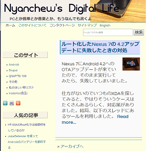
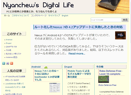
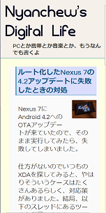
I had proper use for the two themes for the desktop and mobile on this site, so I decided to use the theme that Responsive Design is possible.
Previously, the host names for desktop and mobile are different, and access from the mobile terminal is redirected to a URL for the mobile. It is stopped now.
The following is a summary of the work, it was surprisingly easy.
1. Selection of themes for Responsive Design
This site is built with Drupal. I was using the (sub) theme of Zen 3. x so far. 3. X version does not support Responsive design, but 5. X supports it. I decided to use Zen 5. X by upgrading the same theme. It seems to be good to use the same theme. However, during the transition, I had to use another theme because 3. x and 5. x can not coexist.
http://drupal.org/project/zen
2. Advance preparation
I rewrote the template files and various CSS files in advance before the actual migration. I did the almost same thing to Zen 5. X default templates, CSS, and other files as what I did to Zen3.X files. Once created Zen 5. x sub-theme in the working folder as the new sub-theme of Zen 5. x. Then I put each piece of Zen 3. X modifications to .info, templates, CSS files, and others.
3. Migration theme
While operating in a different theme, I replaced the Zen 3. x sub-theme with the 5. X sub-theme. After Zen 5. x was installed, set the theme to the newly created Zen 5. x sub-theme as the default WEB theme.
4. Adjusting the appearance
Without critical error, the new theme works smoothly. With displaying on different sizes of screens, or on mobile devices, I continue to adjust the CSS to look good on any screen.
In addition, in order to show/hide the block depending on the size of the screen, I wrote small JQuery scripts. It was my first time writing javascript, but it was easy to write a simple script just by determining the screen size and do hide().
URL for mobile is no longer needed, I stopped the setting of redirecting to the mobile URL when it is accessed from a mobile device, then add a set of redirects to the desktop URL when it is accessed by the old mobile URL.
The purpose of the work is to make it easier to manage in a single theme and hostname URL to access, so the WEB design is the same as before. It is not a full-fledged Responsive design, it looks almost unchanged. The advantages of Responsive design are not fully utilized now.
I need a re-design from scratch if I want to make a trendy design such as small blocks moving dynamically.


