Customize Consent Preferences

We use cookies to help you navigate efficiently and perform certain functions. You will find detailed information about all cookies under each consent category below.

The cookies that are categorized as "Necessary" are stored on your browser as they are essential for enabling the basic functionalities of the site. ... 

Always Active

Necessary cookies are required to enable the basic features of this site, such as providing secure log-in or adjusting your consent preferences. These cookies do not store any personally identifiable data.

No cookies to display.

Functional cookies help perform certain functionalities like sharing the content of the website on social media platforms, collecting feedback, and other third-party features.

No cookies to display.

Analytical cookies are used to understand how visitors interact with the website. These cookies help provide information on metrics such as the number of visitors, bounce rate, traffic source, etc.

No cookies to display.

Performance cookies are used to understand and analyze the key performance indexes of the website which helps in delivering a better user experience for the visitors.

No cookies to display.

Advertisement cookies are used to provide visitors with customized advertisements based on the pages you visited previously and to analyze the effectiveness of the ad campaigns.

No cookies to display.

レスポンシブデザインにしました

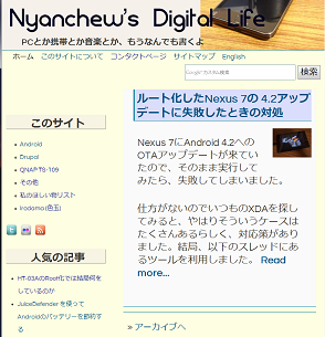
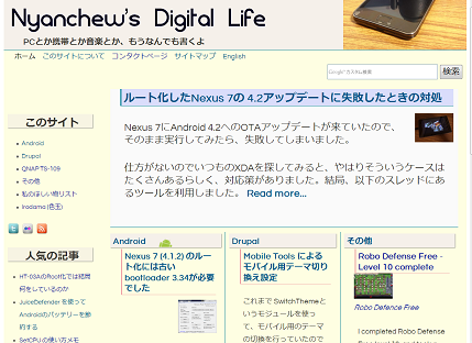
このサイトではデスクトップ用とモバイル用の2つのテーマを使い分けていたのですが、流行のレスポンシブデザインが可能なテーマを使うことにしました。

これまでは、デスクトップ用とモバイル用で異なるホスト名を使用しモバイル端末からのアクセスはモバイル用URLにリダイレクトしていましたが、これも止めることができました。

以下が作業の概要ですが、意外と簡単にできました。

1.レスポンシブデザイン用テーマの選定

このサイトはDrupalで構築しており、これまでZenというテーマの 3.X版(のサブテーマ)を使っていました。3.X版はレスポンシブデザイン非対応ですが、5.X版は対応しています。移行の手間を考えると素直に同じテーマをアップグレードするのが良さそうなので Zenの5.X版にすることにしました。ただし、3.Xと5.Xは共存できないので移行中は一旦他のテーマで運用する必要があります。

http://drupal.org/project/zen

2.事前準備

実際に移行する前にあらかじめ CSSファイルや各種Templateファイルを書き換えておきます。Zen3.XのデフォルトのCSSやTemplateに手を入れていますので同じことをZen5.Xに対して行います。まず、新しい Zen 5.Xのサブテーマを作業フォルダに作成し、.info ファイル、CSSファイル、Templateファイルを使用中のZen 3.Xサブテーマに合わせて書き換えていきます。Zen 3.Xのデフォルトファイルとこのサイト用に修正したファイルとのdiffを取り、diff を見ながらエディタで手で修正していきました。

3.テーマの移行

一旦、WEBサイトのテーマを別のテーマに設定し、その間に Zen3.Xを5.Xに入れ替えます。5.Xのインストールが済んだらWEBのデフォルトテーマ設定を元に戻せばできあがり。

4.見映えの調整など

特に大きなエラーも無く、すんなり立ち上がりました。あとは画面のサイズを変えたり実際にモバイル端末で表示させたりしながら、どの画面でもそれなりに見えるようにCSSを調整していきます。

また、画面のサイズに応じてブロックの表示/非表示を行うため、JQuery のスクリプトも書いています。にわか勉強ではじめて書きましたが、画面のサイズ判定に応じて hide() するだけの簡単なものです。

モバイル用のURLはもはや必要ないので、モバイル端末からアクセスした時にモバイル用URLにリダイレクトする設定は廃止し、逆にモバイル用URLでのアクセスをPC用URLにリダイレクトするように設定しました。

今回の目的は、テーマとアクセスするURLホスト名を1つにして管理をしやすくすることだったので、デザインはいままでと同じです。本格的なレスポンシブデザインをしたわけではないので、見た目はほとんど変わらずレスポンシブデザイン用テーマの利点はあまり活かされていません。

よくある、小さなブロックが動的にがしがし動くようなサイトを作るには最初からデザインのし直しが必要です。

PAGE TOP